 The focus of this article is to help explain with both words and photos just some of the many techniques available to create you very own appliqued kite! This article is intended for people that may have sewn and framed a few kites in the past but have never dared to tackle applique before. I can’t take credit for any of the applique techniques described in this article. There are many people in the kiting community that are credited for helping pioneer the methods we all now use on a routine basis. People like Randy Tom, Stretch Tucker, Bobby Stansfield, Ron Gibian, Scott Skinner and many others helped develop many of the applique methods that most kite builders use today. I simply use a combination of many techniques that I have learned from others over the years. I used all the bits that worked best for my own style of making kites. Feel free to try several variations of your own until you find something that suits your own style best.
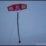 The Antique Tube Radio Genki Kite
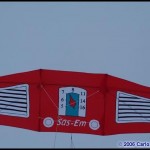
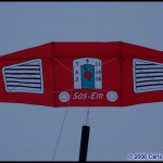
The example I used for this project is a nine foot wide and three foot high single line Genki kite. The artwork I applied transformed this kite from a simple red form into an antique tube radio. I also added an inflatable electrical plug as a tail!
If you have artwork on your computer you can easily print a transparency and use an overhead projector.
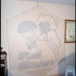
In this case I used my friend, Mark Groshens’ terrific artwork of our local logo to make a club rokkaku. A finished rokkaku sail was taped to the wall and the projector was moved around and adjusted till it fit the sail of the rok to perfection. Tracing all the lines with pencil takes a little while but it gives excellent results in the end.
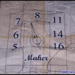
I always start by first completing the entire sail area with the main body colour. It could be a rokkaku a Genki or something else but completing the sail first avoids all the pattern matching and lining up that would have be done if the kite was made in separate sections. The radio dial artwork was drawn out first by hand to full scale on paper. Later it was transferred to ripstop for sewing.
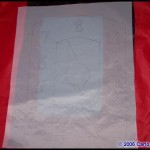 Transferring artwork onto ripstop
I trace the artwork onto the lightest colour of ripstop I will be using. This Genki has black, blue, red and white colours. In this case white was the easy choice. Tracing onto the lightest colour allows you to easily follow the pencil lines while sewing later on. Please note that since there are several colours involved I always cut each additional colour just big enough for each section I am working on. This patchwork method sure helps save on your ripstop use.
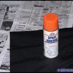
Once you have finished tracing your artwork and all the colours are cut to size you are ready to start using some adhesive. Ripstop is very slippery and it is much easier to work and sew when it is tacked together with glue. Generally I stack my colours with the darkest color on top and work my way down to the lightest colour at the bottom. Having the darkest colours on top helps give your stained glass effect a very nice punchy contrast. More on this stained glass effect later. I use a common temporary spray adhesive that you can pick up at any craft store. These sprays are tacky enough to hold several layers of material together but still allow you to pull them apart when you are ready for cutting later on. Before applying any spray you should dry mount all the sections you are working on onto the main sail. line up each piece on the sail and draw on some reference points with pencil right onto the mail sail. Pencil lines are easy to erase later.
Spread out some newspaper outside the house and apply some spray to your first colour. The spray remains tacky pretty much forever so you can take your time while applying your piece to the main sail. Flatten out the piece and work out as much of the wrinkles and air pockets as you can. If you did not get it quite right you can pull the piece off the sail and apply it again in the right spot. Repeat the same process until all the colour changes are added to the main sail.
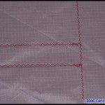
The zigzag is the best stitch for any applique sewing because of its staggered spacing. The zigzag simply locks the pieces together better. If you decide to use a straight stitch the material may in fact pull apart over time and you will end up with several unwanted holes in your sail. You can see the zigzag I used is not very large but it is well spaced apart. If you sew a very tight stitch and all those close perforations just may cause serious tears in the future. This zigzag stitch is one of those things you can play with until you find the size that suits your project best. Now you just have to follow ond sew on top of all your pencil lines with your sewing machine. See another larger view of the same section.
The final photos in this section show the completed sewn section from the back and then from the front.
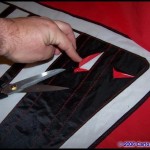 Cutting away the unwanted bits
Believe it or not you are now ready to remove the colours that you don’t want. I use a pin and stitch ripper to open up and separate the various layers of colours I intend to cut away. Take your time while poking through the ripstop as you do not want to damage the parts you want to keep. Once you have opened up the material enough you can work in your scissors to cut along the stitching. When I start to cutting I cut all the unwanted colours together at the same time. You want to try and cut with a nice smooth motion. Cut close to the stitching but not right up to or touching it.
As you start cutting away the various layers the kite starts to reveal itself to you. This particular kite had three distinct areas of applique to work on. There were the speakers on each end of the genki and the dial in the center section. Working with just one section of the kite at a time makes gluing, sewing and cutting a little easier.
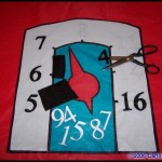
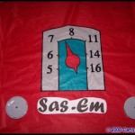
The majority of the applique is now complete but Where are the numbers on the dial and buttons to turn it on and off? The numbers I chose for the dial were too small for applique. I decided to cut them out by hand and apply them one at a time on top of the sail. I made up paper patterns for each number and used the patterns to cut the ripstop to size. I applied each number one at a time until completed. The pictures taken in my front window show you how it would look outside from the front and the back.
I had thought about what brand name and buttons I should put on the kite but had not decided on anything until I got to this point. This allowed me to use some CD cases and some computer generated lettering to play with the final look of the kite. Yes, you can still make creative decisions when you are almost finished! I finally found the look and lettering I liked best and transferred it to ripstop. In case you are wondering I used parts of my daughters names to create the Sas-Em brand of radio.
The stained glass effect in the case of kites refers to what you see when you fly your kite outside. As you read above, you sew all the layers together and cut away the parts you don’t want. This is the stained glass effect you would see much as a window in any church you might visit. There is a little more to this stained glass story. Using a dark colour like black on the very top of your kite creates a border that makes your colour changes behind stand out the most.
You will also notice I left almost all the white colour on the back of the kite as it did not change the colours of the main body at all. Why should I cut it out when it adds strength to the sail. I did cut out a little section on the back of the dial. The rich red of the sail did not match the rest of the dial with white and blue behind it. When you are inside it is very obvious that the back of the kite is covered in white. The fact is when you are outside the white looks almost invisible. You can see this in the window shot of the back of the kite.
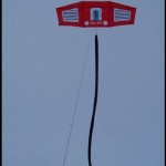 I have given you a lot of ideas to think about but the most important thing to remember is to keep learning new things as you make more and more kites. Join a local club and attend kite building workshops to get more new ideas. Feel free to try out your ideas on some ripstop in the near future!
Good flying,
Carlos Simoes

